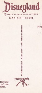
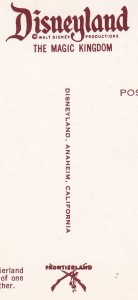
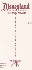
In entering data into the checklist database, I thought it would be worthwhile to highlight something regarding variations. The variations that are most common in the cards fall into only a few categories. In this particular post, I will feature several variations from card NT0312, Frontierland Entrance having to do with text (and one bonus from NT0727A). None of this info is new…but I wanted to show it all side by side in this post.
On the back of the earlier Disneyland post cards, there is some text related to the Disney company and the Disneyland park, and also a logo related to the particular land of the card in question. They never seemed to really decide with certainty what they wanted to have for this text and logo combination, thus the variations. Witness here:
 |
 |
 |
| NT0312 | NT0312a | NT0312c |
(First of all…NT0312b has more to do with the coloration of the actual card, so its not shown here. Its back is just like NT0312.) On these three cards though, you get a brief primer on text variations on the back of Disneyland post cards. Between the vertical Disneyland Inc., and the “THE MAGIC KINGDOM”, there are clear differences.
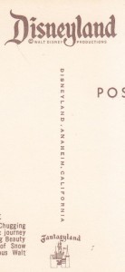
And while these variations are probably the most common, there are more. For example…take a look at the back of this card, NT0727A:
 “THE MAGIC KINGOM” text is totally absent.
And so it goes. These are not the only variations. There are, like I said, variations in logo and other aspects of the cards. I am actually thinking of adding a static page to the menu bar to detail these…so if you have any obscure variations you want to have listed in that article, please let me know.
Until next time…
